はじめに
Swift UIを学び始めたので、押した時にアニメーションするカードを作成してみました。 学習の記録として残しておきます。
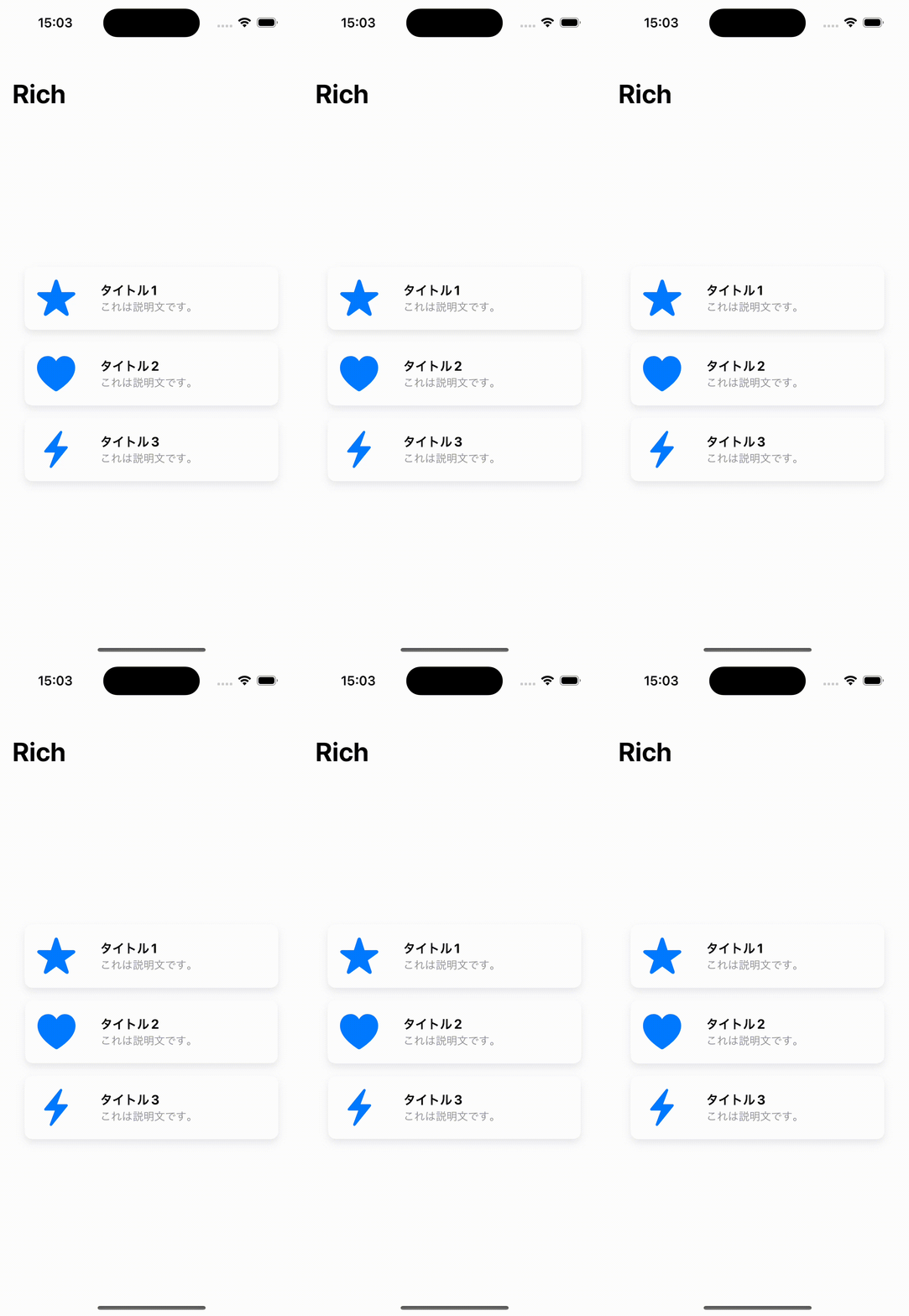
最終的にはこうなりました。
組み立て
import SwiftUI

struct ContentView: View {
    var body: some View {
        NavigationView {
            VStack(spacing: 16) {
                CardView(icon: "star.fill", title: "タイトル1", description: "これは説明文です。")
                CardView(icon: "heart.fill", title: "タイトル2", description: "これは説明文です。")
                CardView(icon: "bolt.fill", title: "タイトル3", description: "これは説明文です。")
            }
            .padding()
            .navigationTitle("Rich")
        }
    }
}

struct CardView: View {
    let icon: String
    let title: String
    let description: String

    var body: some View {
        HStack {
            Image(systemName: icon)
                .resizable()
                .aspectRatio(contentMode: .fit)
                .frame(width: 50, height: 50)
                .foregroundColor(.blue)
                .padding()

            VStack(alignment: .leading) {
                Text(title)
                    .font(.headline)
                    .fontWeight(.bold)

                Text(description)
                    .font(.subheadline)
                    .foregroundColor(.gray)
            }
            .padding(.leading, 8)

            Spacer()
        }
        .background(Color.white)
        .cornerRadius(10)
        .shadow(color: Color.gray.opacity(0.2), radius: 5, x: 0, y: 5)
        .padding(.horizontal)
        .onTapGesture {
            // ボタンがタップされたときの処理
        }
    }
}

struct ContentView_Previews: PreviewProvider {
    static var previews: some View {
        ContentView()
    }
}
ここまで書くとこのようになります。

アニメーションの追加
ここまでできたらアニメーションを追加しましょう。
struct CardView: View {
    let icon: String
    let title: String
    let description: String
    let height: CGFloat
+   @State private var isPressed = false

    var body: some View {
        HStack {
            Image(systemName: icon)
                .resizable()
                .aspectRatio(contentMode: .fit)
                .frame(width: 50, height: 50)
                .foregroundColor(.blue)
                .padding()

            VStack(alignment: .leading) {
                Text(title)
                    .font(.headline)
                    .fontWeight(.bold)

                Text(description)
                    .font(.subheadline)
                    .foregroundColor(.gray)
            }
            .padding(.leading, 8)

            Spacer()
        }
        .frame(height: height)
        .background(Color.white)
        .cornerRadius(15)
        .shadow(color: Color.gray.opacity(0.2), radius: 5, x: 0, y: 5)
        .padding(.horizontal)
-        .onTapGesture {
-            // ボタンがタップされたときの処理
-        }
+        .scaleEffect(isPressed ? 1.05 : 1.0)
+        .animation(.spring(response: 0.3, dampingFraction: 0.6, blendDuration: 0.2), value: isPressed)
+        .onTapGesture {
+            withAnimation {
+                isPressed.toggle()
+            }
+            DispatchQueue.main.asyncAfter(deadline: .now() + 0.2) {
+                withAnimation {
+                    isPressed.toggle()
+                }
+            }
+        }
    }
}
これをビルドすると、このようにカードを押した時のアニメーションが追加されるはずです!